Styling Widget - Inputs

Elevate your splash form with custom styling.
Prerequisites: You must already be in edit mode with your splash page. (See Finding and Editing Your Splash Page.)
There are three types of settings in this section and have a color border to show which it is:
• WYSWYG: You can see the effect of these changes immediately as you make adjustments. (Image will have a solid green border.)
• SAVE: You must save the changes in the Configuration Panel before you can see the effects. (Image will have a dashed orange border.)
• PUBLISH: You must publish the page in order to see the effects. (Image will have a dotted cyan border.)
A splash page FORM is the border and the area inside the border and encloses the input fields.

1. Hover over the widget until you see the blue Edit button appear in the upper lefthand corner of the widget and click it. The Styling configuration panel will appear.

2. Click INPUTS to expand the section.

3. Inputs Background Color - This setting allows you to customize the default background color.

4. Inputs Background Opacity - This setting allows you to customize the default background opacity.

5. Inputs Font - This setting allows you to use one of three custom fonts for the inputs on your form. If none is chosen, the default font will be used.

To use a custom font, you first need to load it onto your splash page. For step-by-step instructions, refer to Custom Fonts.
6. Inputs Label Font - This setting allows you to use one of three custom fonts for the inputs label on your form. If none is chosen, the default font will be used.
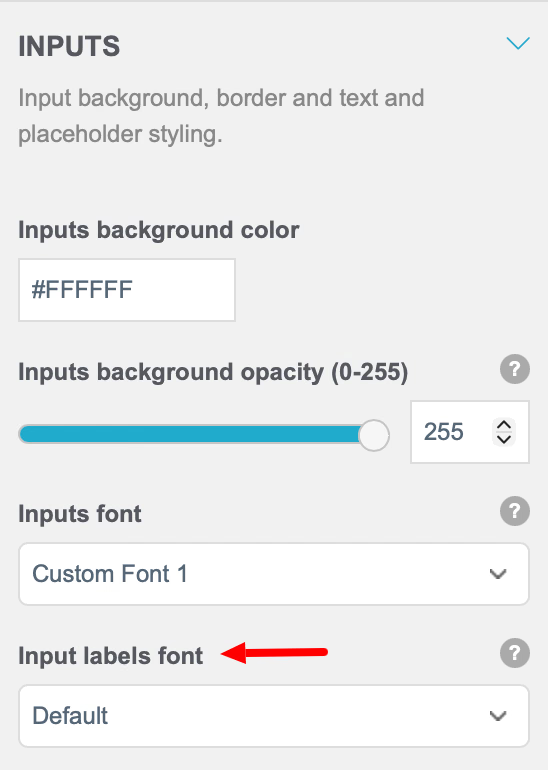
To use a custom font, you first need to load it onto your splash page. For step-by-step instructions, refer to Custom Fonts.
7. Label Font Color - This setting allows you to customize the color of the button font.

Click inside the field to display the color pallete .
8. Inputs Placeholder Color - This setting allows you to customize the color of the placeholder in your input fields.

9. Inputs Border Color - This setting allows you to customize the color of the inputs border.
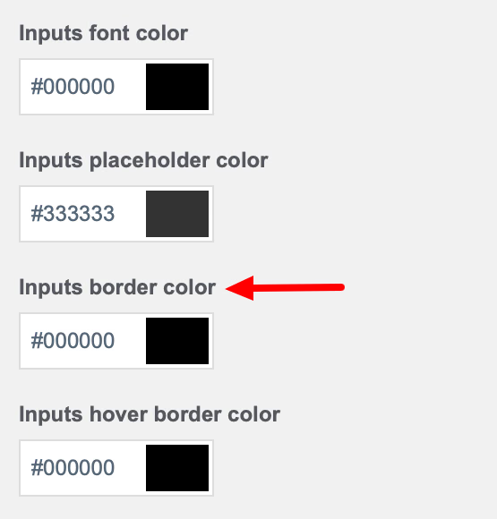
10. Inputs Hover Border Color - This setting allows you to customize the color of the inputs border when a guest hovers over the field.
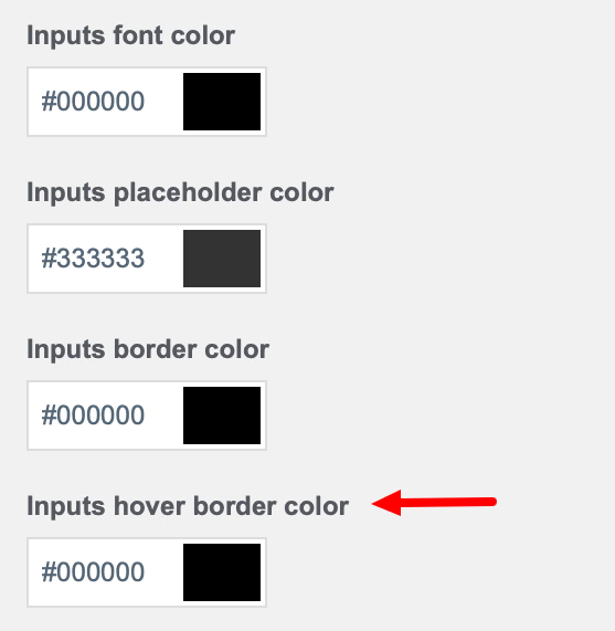
11. Inputs Border Size - This setting allows you to customize the size of the inputs border in pixels.

12. Hide Top, Right, Bottom, Left borders - These settings allow you to remove a side of the border you do not wish displayed around input fields.

13. Inputs Border Radius - This setting allows you to customize the shape of the inputs border corners in pixels.
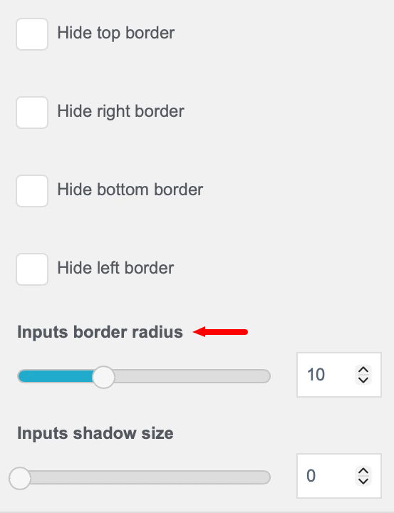
14. Inputs Shadow Size - This setting allows you put a shadow around your inputs.

15. Inputs Shadow Color - This setting allows you customize the color of the shadow around your inputs.

16. Inputs Shadow Offset X - This setting allows you to shift the shadow around your inputs to the right.

18. Inputs Shadow Offset X - This setting allows you to shift the shadow around your inputs down.

19. Checkbox Background Color - This setting allows you to customize the background color of the form's checkboxes.

20. Checkbox Color - This setting lets you customize the color of the form's checkboxes once a guest has selected them.
See also: